
AIPM & The Efficient Frontier
What is the Efficient Frontier?
Many of you may be familiar with the concept of the Efficient Frontier and the graph associated with it. The idea was first introduced in 1952 by Harry Markowitz, who then continued his research and development of the concept and eventually won a Nobel Prize in Economics in 1990.
At its simplest, the purpose of the traditional Efficient Frontier graph is to provide a visualization for investors trying to earn the maximum return on their investments. The graph illustrates the trade-off between the risk they are willing to take, and the return they can be expected to earn (e.g. I can make a higher return if I am willing to take on more risk). The ‘Efficient Frontier’ is the optimal combination of investments, as represented by the line in the graph below.
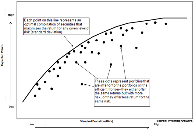
Sample Efficient Frontier graph from InvestingAnswers.com
How Can The Efficient Frontier Be Applied to Asset Investment Planning and Management (AIPM)?
Copperleaf’s customers use C55 to create an optimized asset investment plan. More specifically, they utilize the C55 optimizer to find the combination of investment alternatives and start dates that will provide the maximum value. However, sometimes the constraints are not firmly established and management is looking for information to help define the constraints. To help with this problem, an Efficient Frontier graph can be utilized. In this instance, the Efficient Frontier graph represents the question: ”What is the maximum value I can achieve (e.g. what is the most risk I can mitigate) for a given level of investment?”
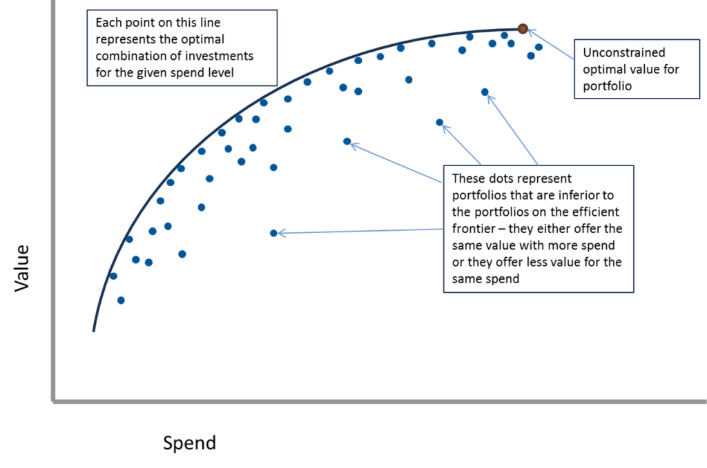
Sample Efficient Frontier graph for AIPM (Copperleaf)
We refer to this as our own “Efficient Frontier” because the line represents the boundary (or frontier) between achievable and unachievable values. For any given level of investment (the x-axis), the line represents the maximum value that can be obtained for that particular spend level.
The endpoint of the graph represents the highest possible net value that can be obtained regardless of how much money is spent. As shown on the graph, it is possible to spend more money, but obtain less value.
Visualizing Optimized Asset Investments Using the Efficient Frontier
In C55, each of the points plotted on the frontier are taken from optimized scenarios (i.e. the optimizer is run with the specified constraint to determine the optimal value). The endpoint of the graph is obtained by running an unconstrained scenario. From the viewpoint of pure economics, the unconstrained scenario is the ”best” solution. However, the economically optimal point might represent an unrealistic budget level, so the graph can be helpful in visualizing the total benefit being foregone when a lower constraint is chosen.
The graph can also be useful for understanding the impact of management overrides. For example, if there is a management decision to override the optimization recommendation for specific investments, then the resulting scenario will end up below the efficient frontier line. In such circumstances, the distance these scenarios fall below the line will help in understanding the significance of the override.
To learn more about how to value and optimize your investment portfolios, check out this white paper.